salon cozzolino
Industry
Personal Care Services
Role
Graphic Design
Key Deliverables
Visual Identity, Logo Design, Signage
Overview
Located in the heart of Downtown Menlo Park, California, Salon Cozzolino was preparing to open its doors during one of the most uncertain periods for small businesses: the height of the COVID-19 pandemic. Despite the challenges, the salon's vision remained clear: create a welcoming destination where every client could reconnect with themselves through beauty, confidence, and self-care.
The objective was to develop a sophisticated brand identity that reflected the salon's elevated experience while remaining warm, approachable, and inclusive. Every touchpoint was designed to communicate luxury without intimidation, inviting clients of all backgrounds, identities, and personal styles to feel seen, celebrated, and cared for.
The logo system was intentionally designed with longevity in mind, balancing timeless elegance with modern simplicity. Clean typography and a refined aesthetic allow the identity to appeal across genders while establishing a premium presence within the competitive Peninsula salon market.
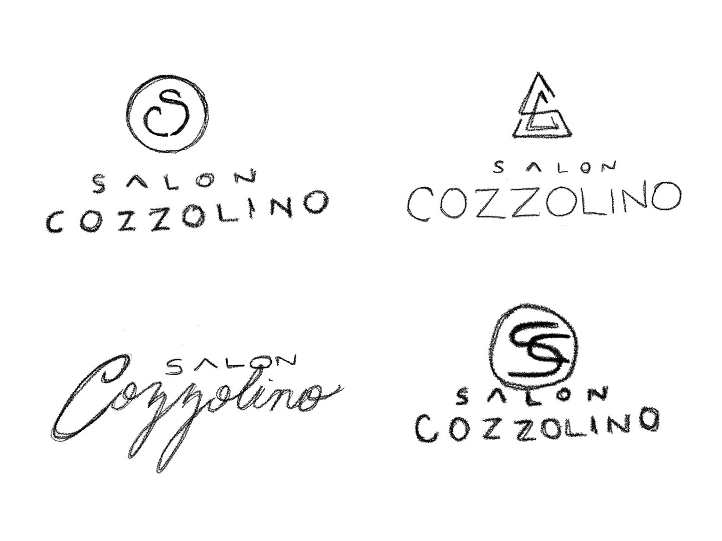
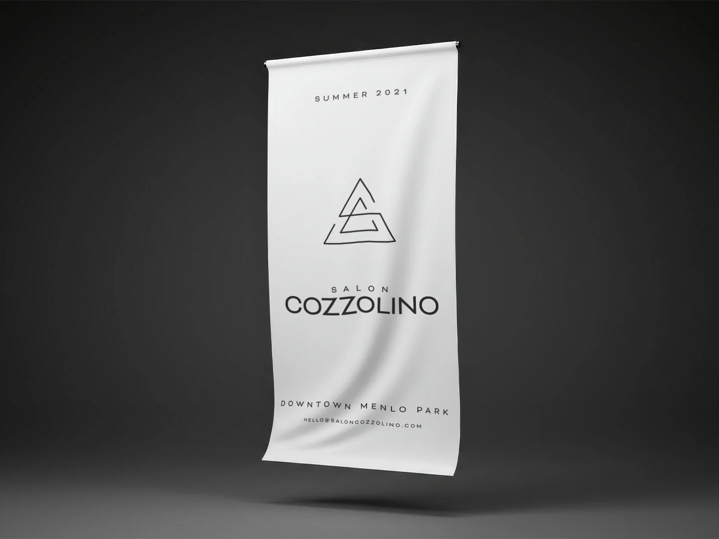
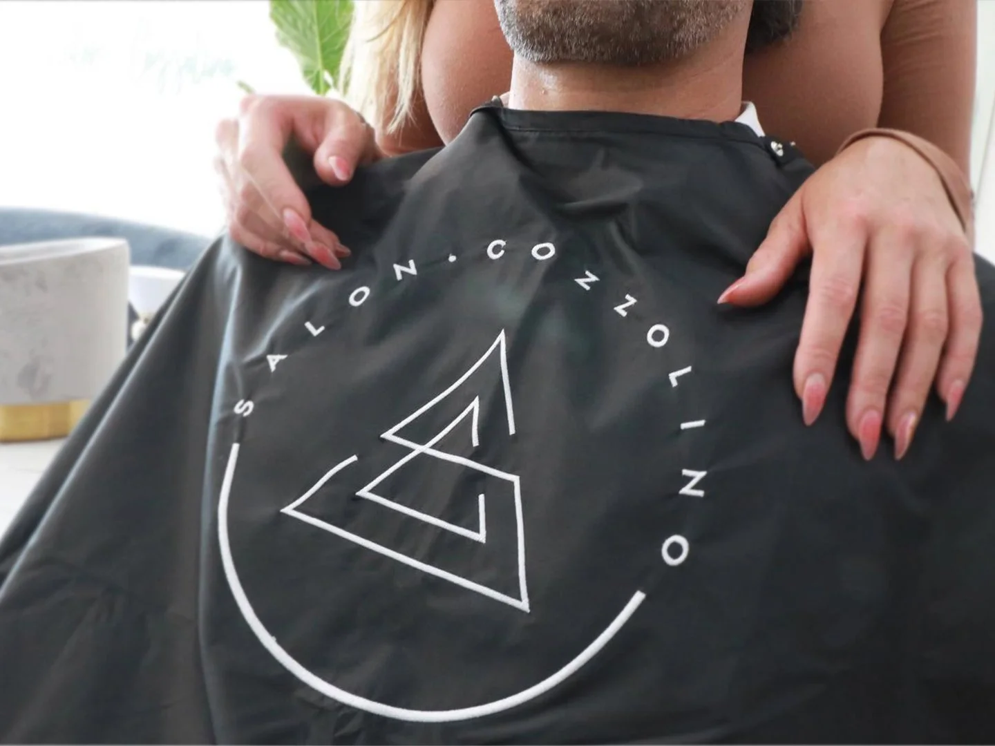
At the heart of the identity is a custom monogram that intertwines the initials S and C within an equilateral triangle. The triangle represents balance, unity, and strength, while its sharp geometric points subtly reference the precision of freshly cut hair. An official seal variation frames the mark within a circle, symbolizing community, trust, and the lasting relationships built between stylists and their clients. Together, the logo system creates a foundation that feels both contemporary and enduring, a visual identity designed to become part of the Cozzolino family legacy.
The brand palette embraces restraint, allowing craftsmanship and client experience to take center stage. Black and white serve as the primary colors, creating a timeless, high-contrast foundation that communicates sophistication, confidence, and simplicity. Their versatility ensures the identity remains elegant across both digital and physical applications.
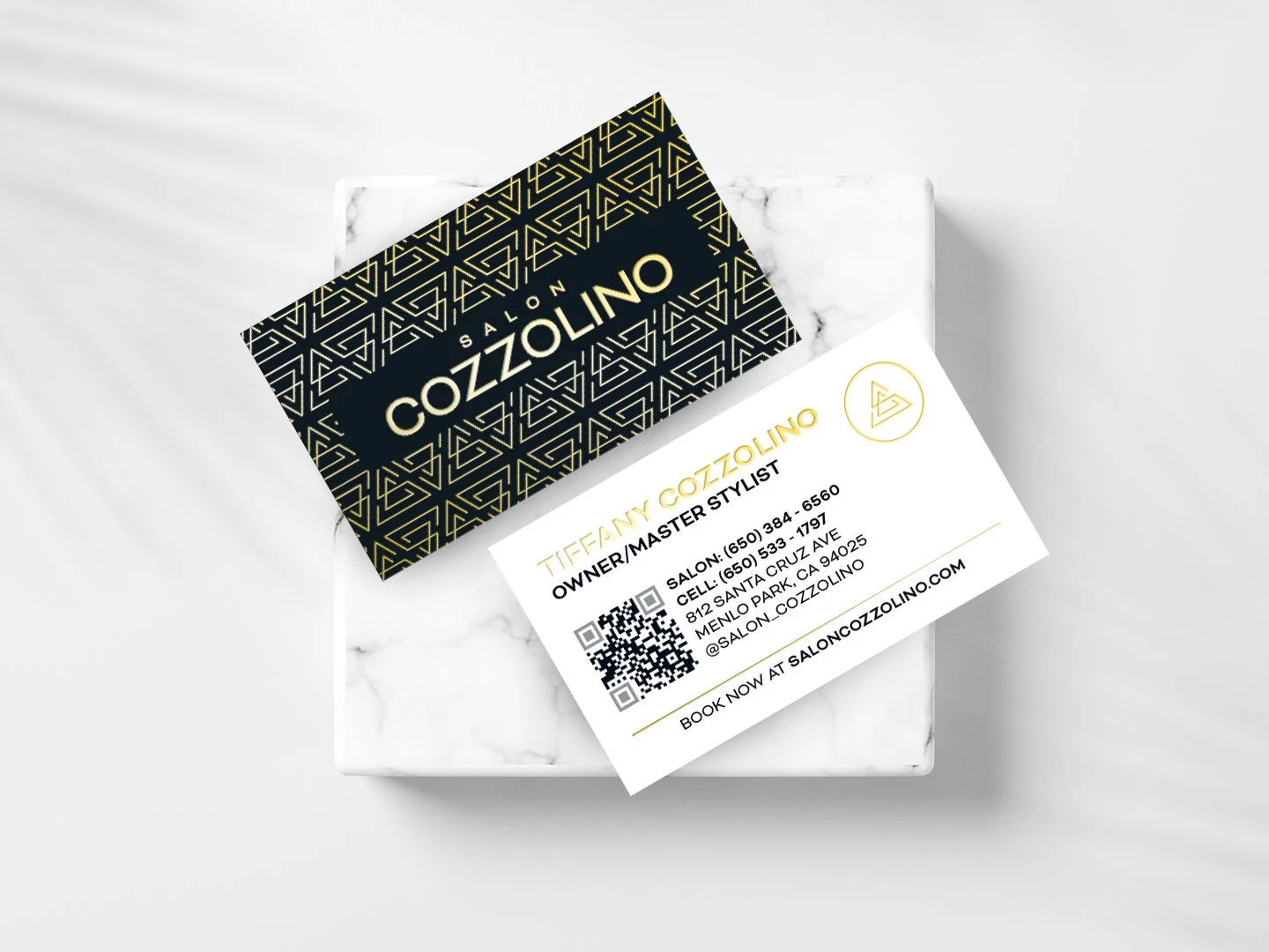
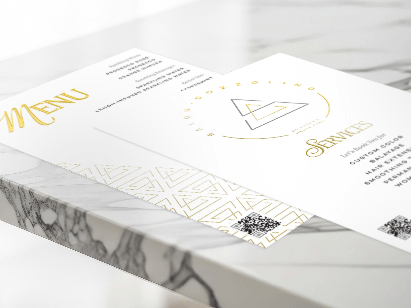
Metallic gold and silver were introduced as accent colors to elevate the overall experience. Gold represents luxury, warmth, and exceptional service, while silver adds refinement and modernity. Rather than overpowering the identity, these metallic finishes are used selectively to create moments of distinction bringing subtle richness to printed materials and environmental branding through embossed foils and premium production techniques.
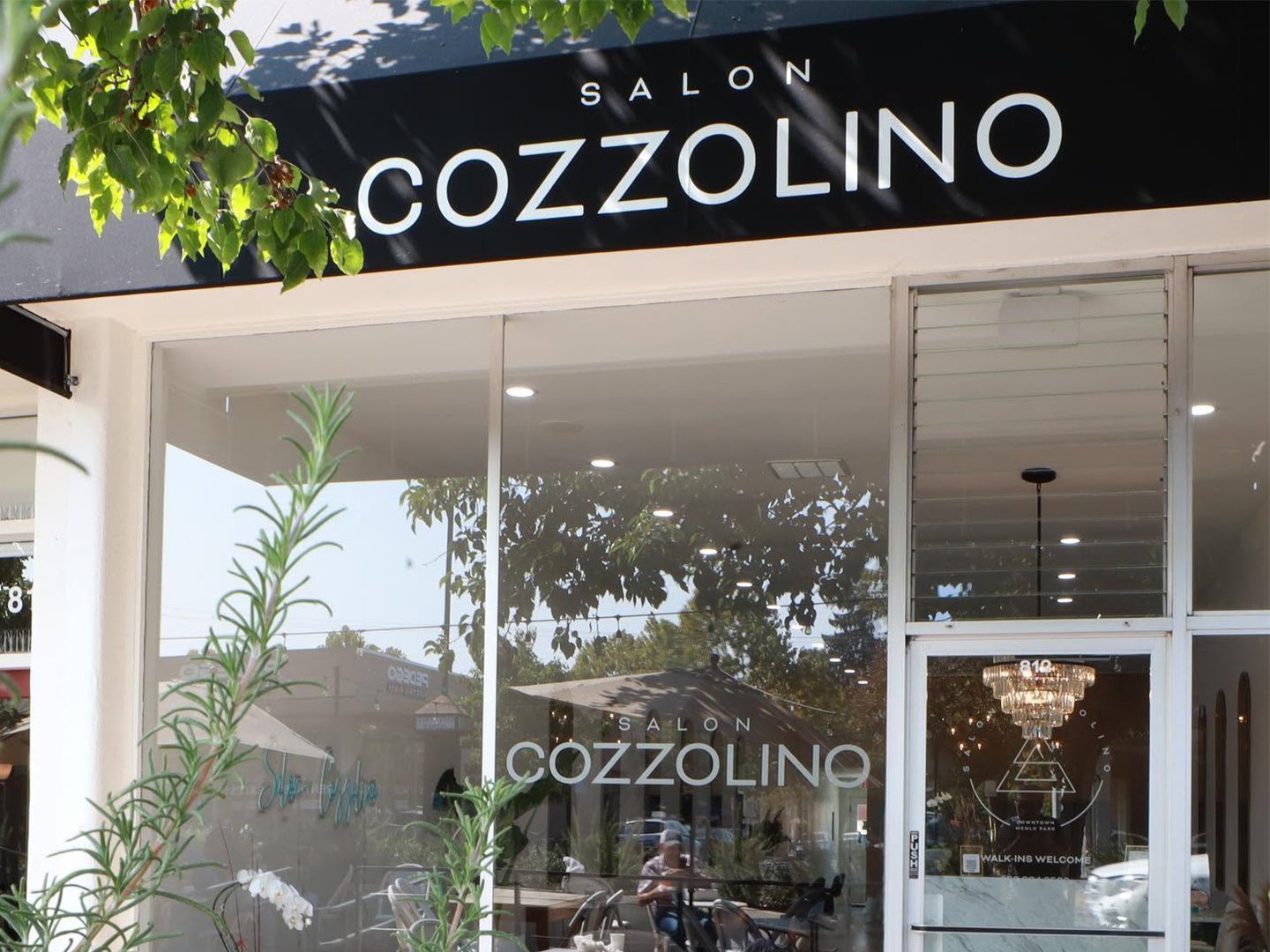
To establish a cohesive presence from the moment clients arrived, the identity was thoughtfully extended across both environmental and printed collateral. Exterior branding included a custom storefront awning, window and door vinyl graphics, and a grand opening banner that generated excitement while introducing the salon to the Downtown Menlo Park community. Each application was designed to create a polished first impression and reinforce brand recognition before clients ever stepped inside. Inside the salon, the experience continued through a suite of premium print materials including business cards, a service menu, and a curated drinks and treats menu. Produced with metallic gold foil embossing, these pieces transformed everyday customer interactions into elevated brand moments reflecting the salon's attention to detail, commitment to quality, and luxurious guest experience.