Caccia Home Services
Industry
Home Services / Trades
Role
Graphic Design
Key Deliverables
Visual Identity, Brand Guidelines, Print Collateral, Social Media, Website Design
Overview
Caccia Home Services Brand Refresh
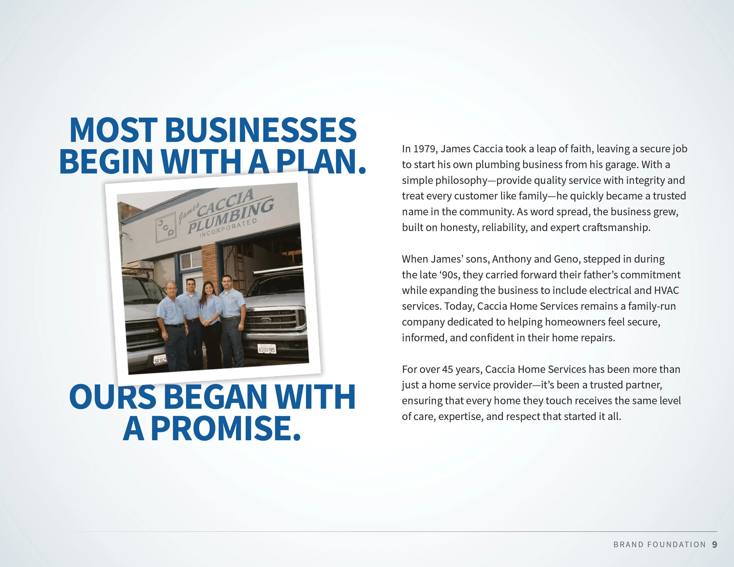
After decades of trusted service in the Bay Area, Caccia Plumbing entered a new chapter. With a transition in leadership and an expanded service offering that now included electrical, heating, air, and ventilation solutions, the family-owned business needed a brand that reflected its evolution while honoring the reputation it had built over generations.
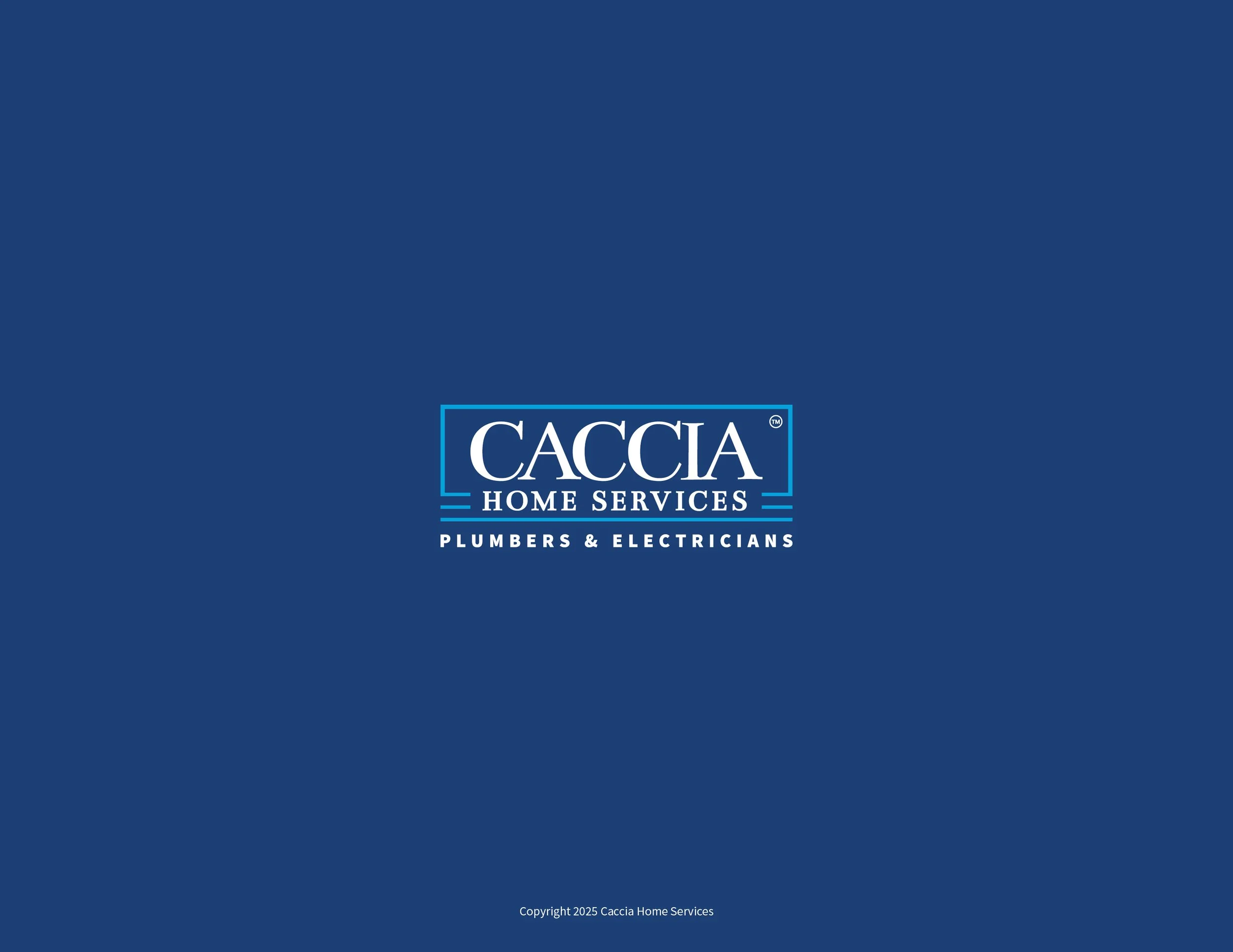
What began as a logo redesign quickly became a deeper exploration of the brand's identity. Multiple logo concepts were developed and evaluated alongside the existing mark: a logo I had originally designed in 2017. Throughout the process, it became clear that the leadership team still had a strong connection to the original design. Customers had come to recognize and trust the logo, and its simple structure had become synonymous with the company's reputation.
Rather than reinventing the brand, we focused on refinement.
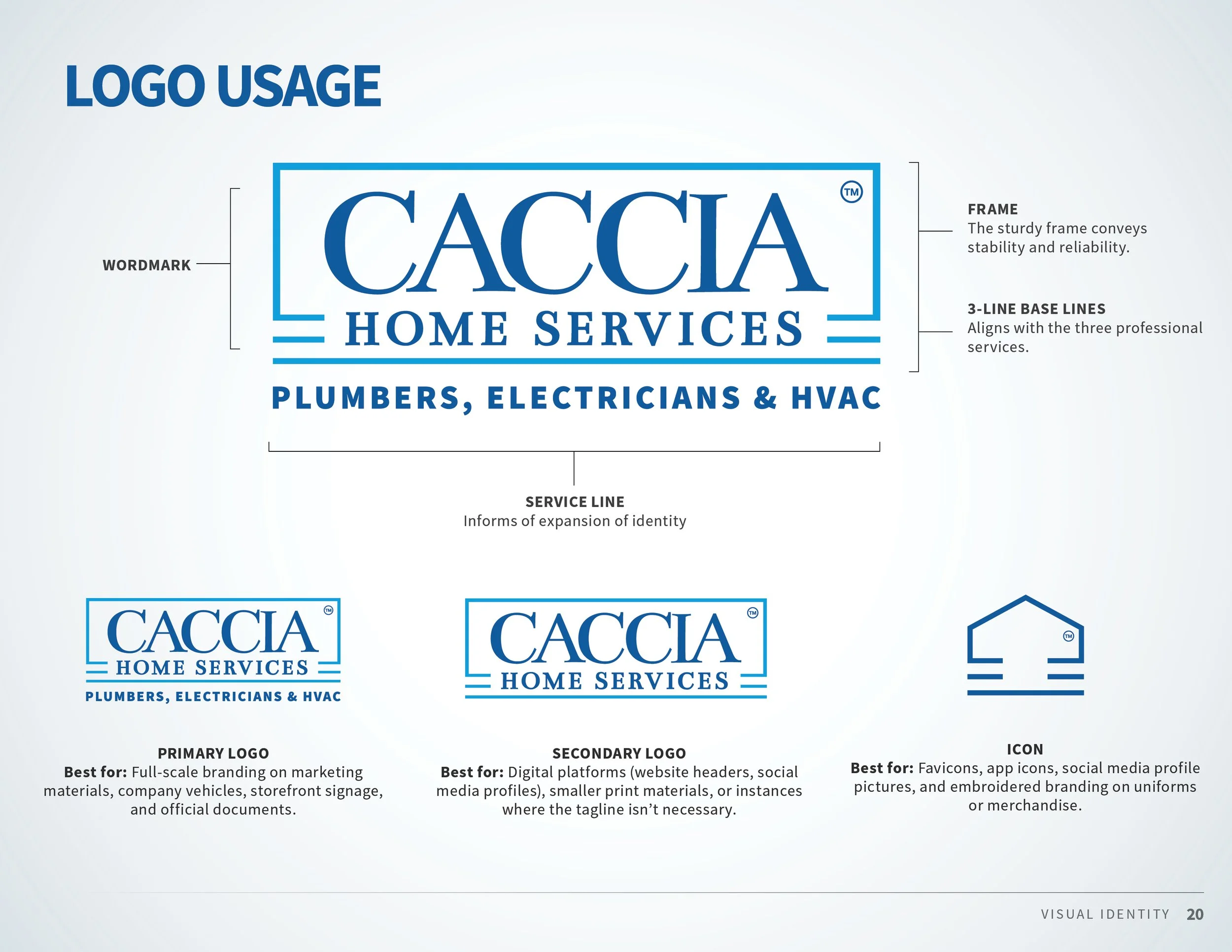
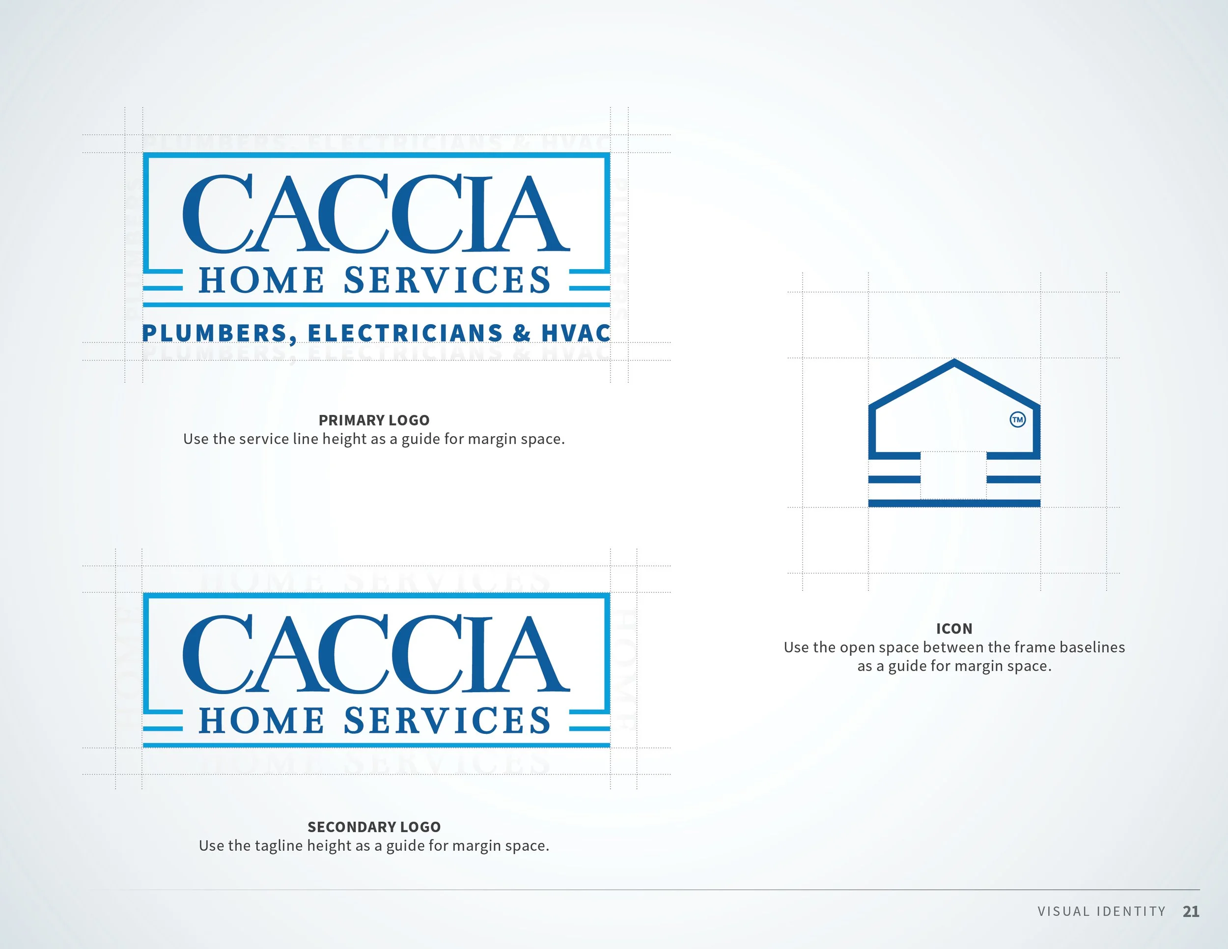
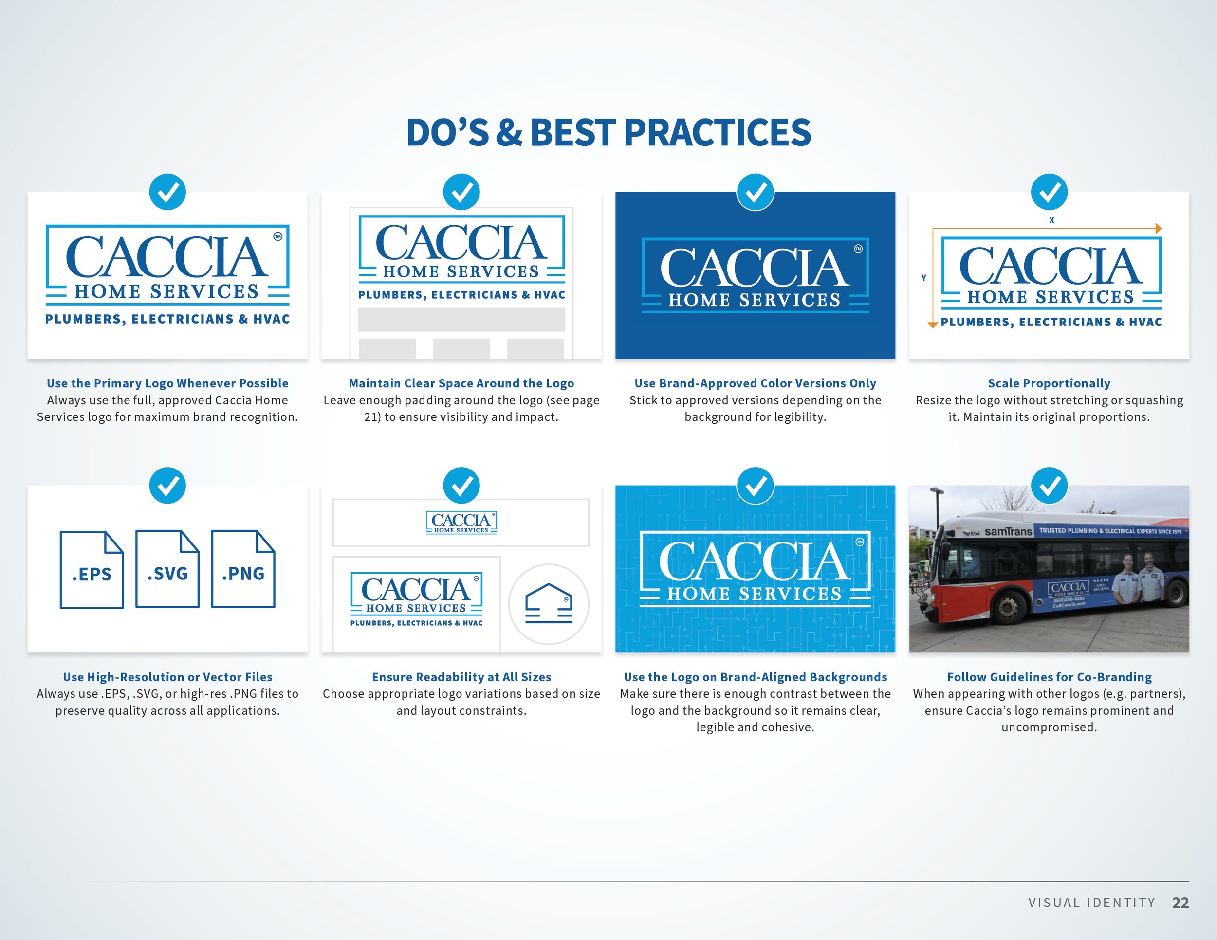
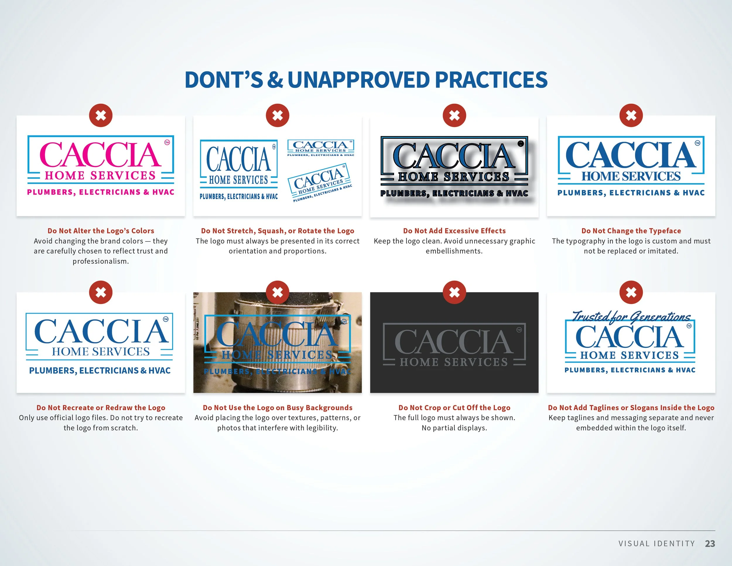
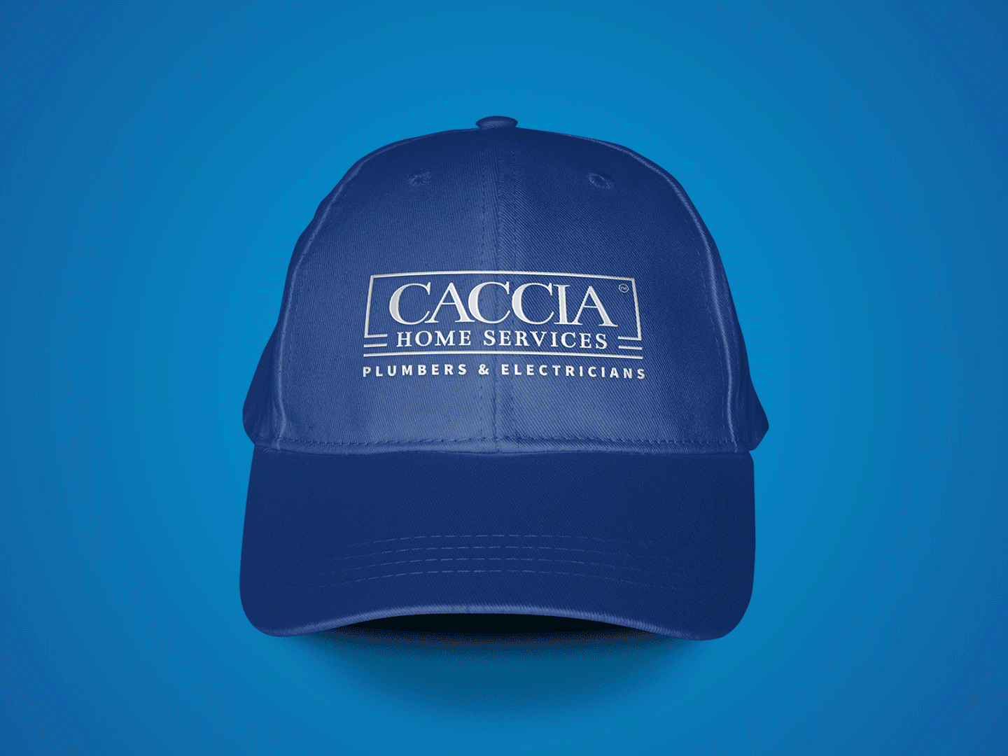
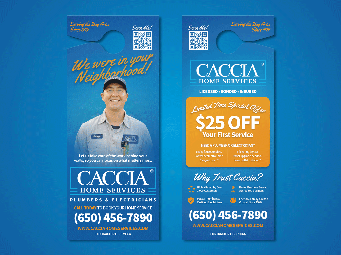
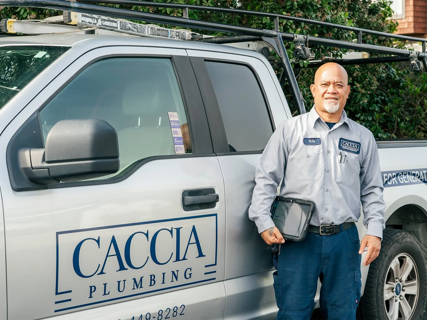
The refreshed logo preserves the familiar frame and four foundational lines that had become visual symbols of stability, reliability, and craftsmanship. The updated design introduces a new two-color application and a supporting icon mark that transforms the recognizable frame into a house-shaped symbol, reinforcing the company's expanded role as a complete home service provider. The result is a modernized identity that feels both familiar and future-focused.
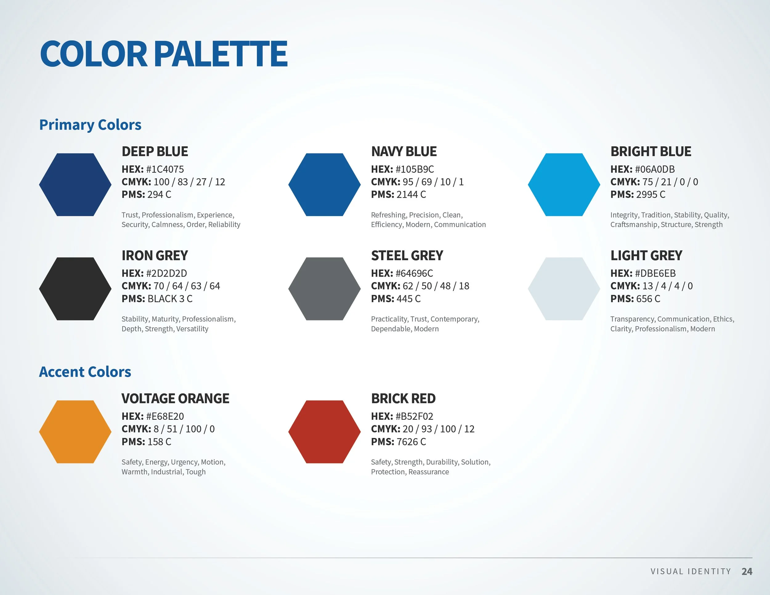
The visual identity system was expanded through an updated color palette that continues to leverage light and dark shades of blue to communicate trust, experience, and dependability. Neutral gray tones were incorporated to reinforce professionalism and transparency across marketing materials. New accent colors of orange and red were strategically introduced to create moments of visibility, urgency, safety, and reassurance. These are qualities that resonate strongly within the home services industry.
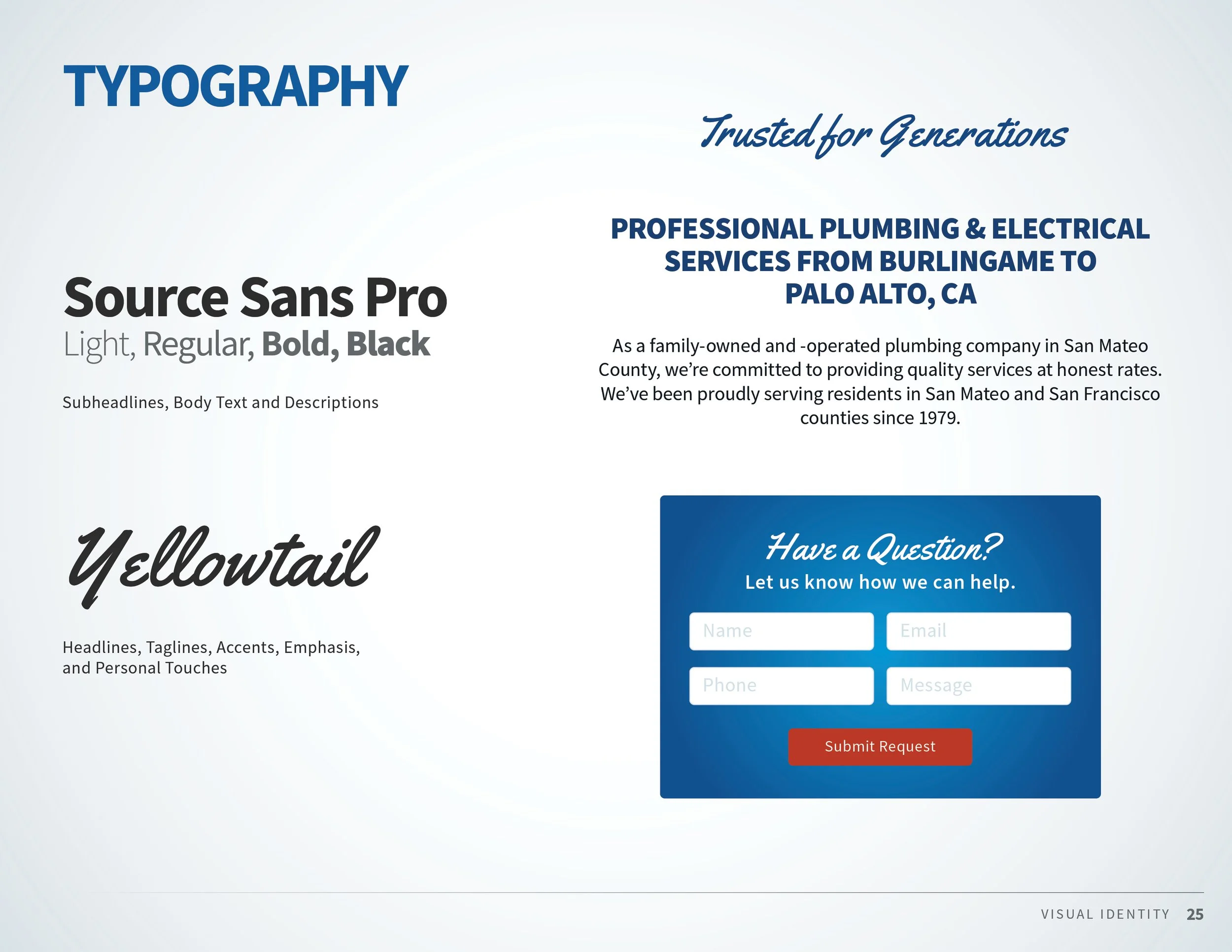
Typography also evolved as part of the refresh. While previous materials relied heavily on Bentham, the new system shifts toward Source Sans Pro as the primary typeface, creating a cleaner, more versatile visual language across print and digital platforms. Yellowtail was introduced as a complementary script font to add warmth and personality, providing a family-owned touch for taglines, highlights, and customer-facing messaging.
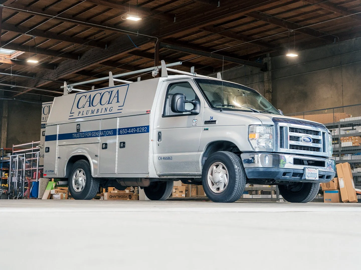
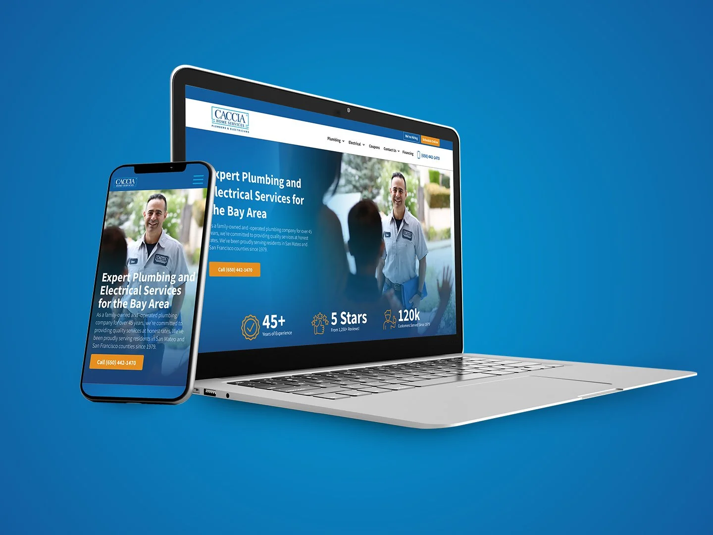
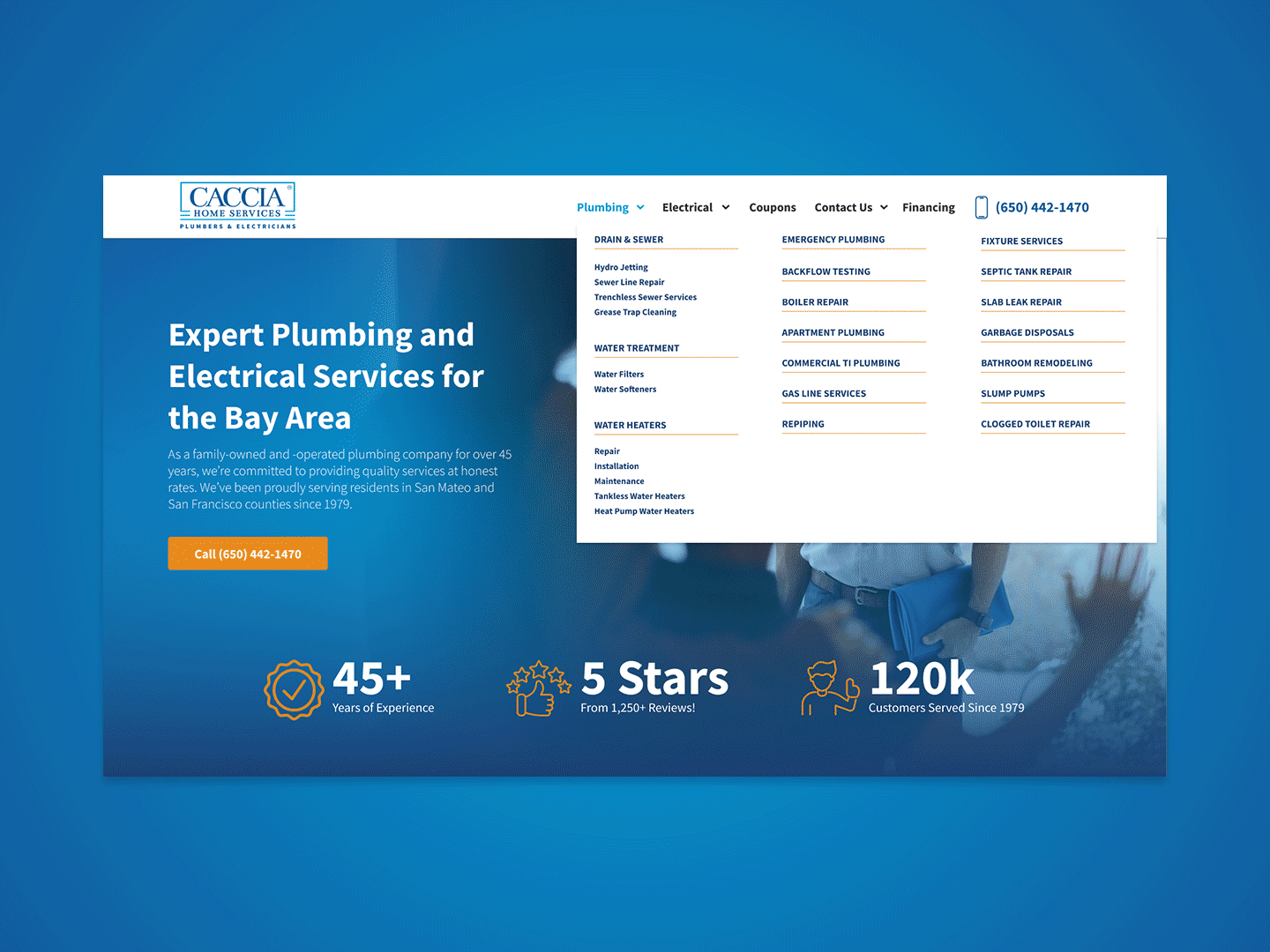
As the brand system took shape, the project expanded into a broader ecosystem of customer and employee touchpoints. The refreshed identity was applied across a redesigned website, business cards, door hangers, direct mail pieces, and launch materials introducing the company's expanded service offerings.
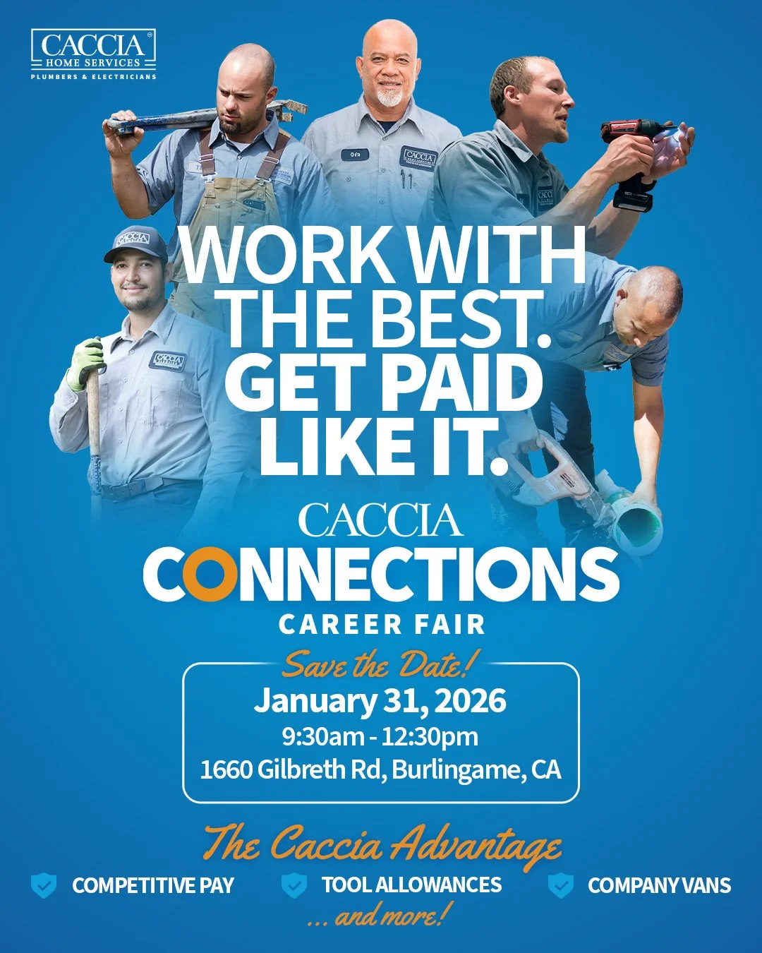
Caccia Connections Career Fair Campaign
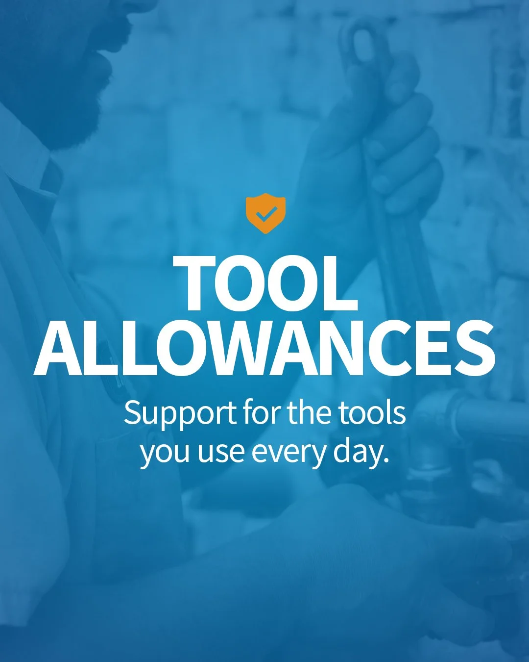
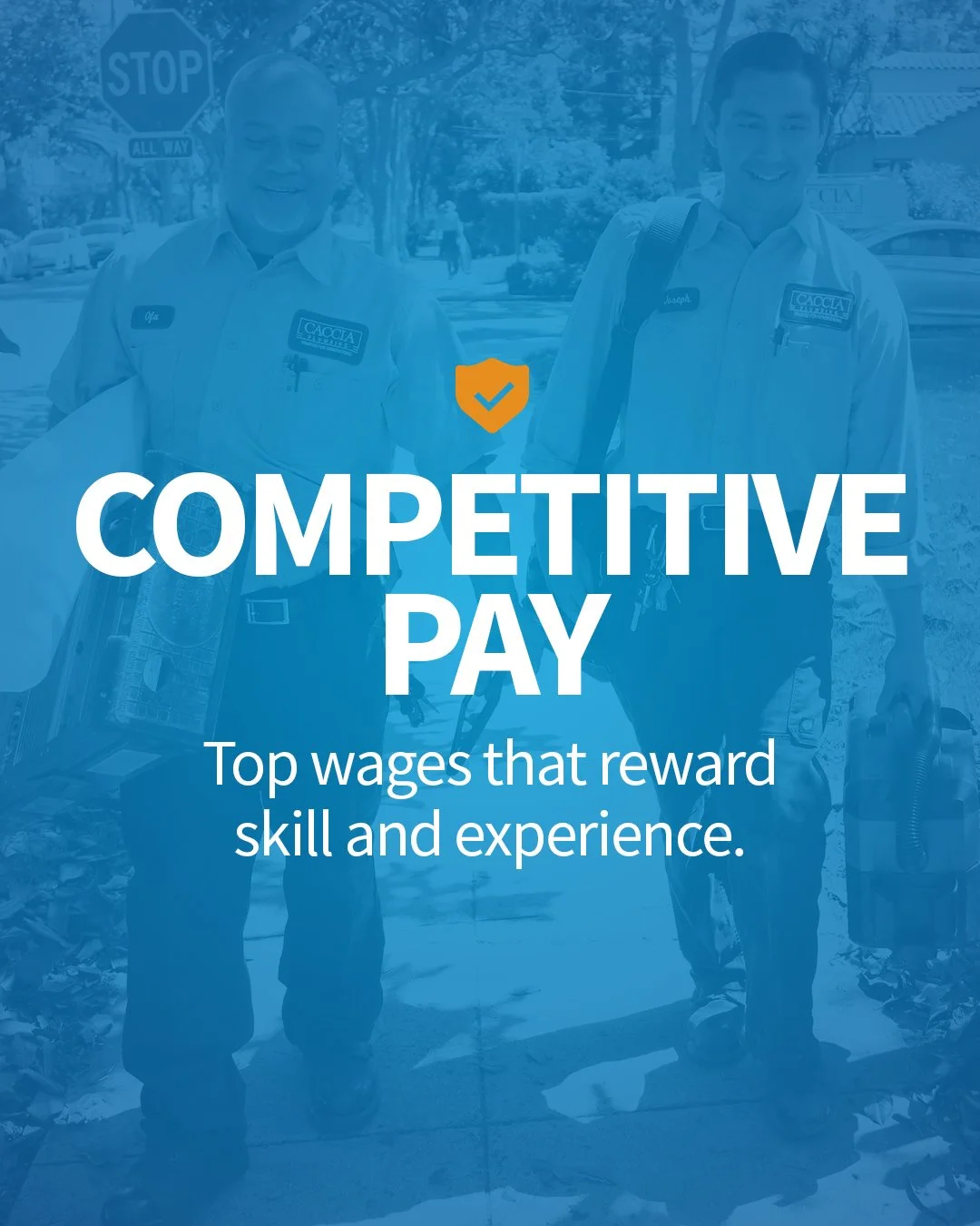
To support company growth, Caccia launched the Caccia Connections Career Fair, an initiative designed to attract experienced technicians while showcasing the company's culture, facilities, and long-term career opportunities.
The event invited candidates to meet leadership, tour the newly expanded office and warehouse, connect with existing team members, and interview for open positions in a single visit. The campaign positioning emphasized family values, professional development, and the opportunity to build a lasting career with a company committed to investing in its employees.
Marketing materials included a coordinated suite of social media graphics, printed promotional signage distributed throughout the community, recruitment collateral, event wayfinding, and a large-format banner displayed along Highway 101. Together, these assets created a cohesive recruitment campaign that elevated employer branding while introducing a new generation of skilled trades professionals to the Caccia team.
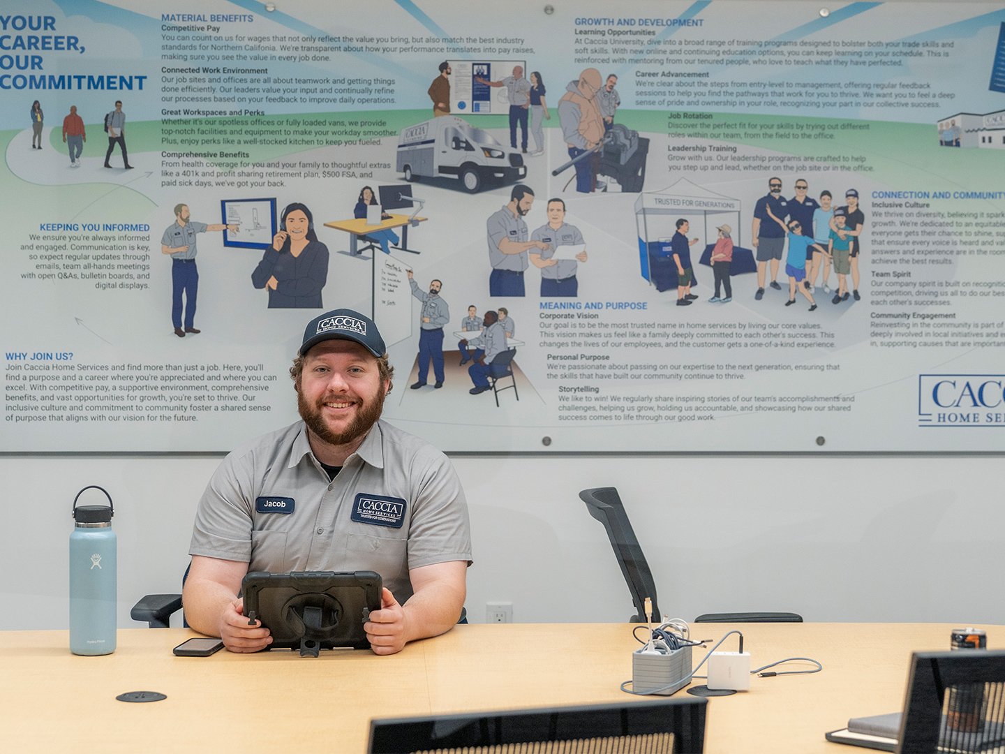
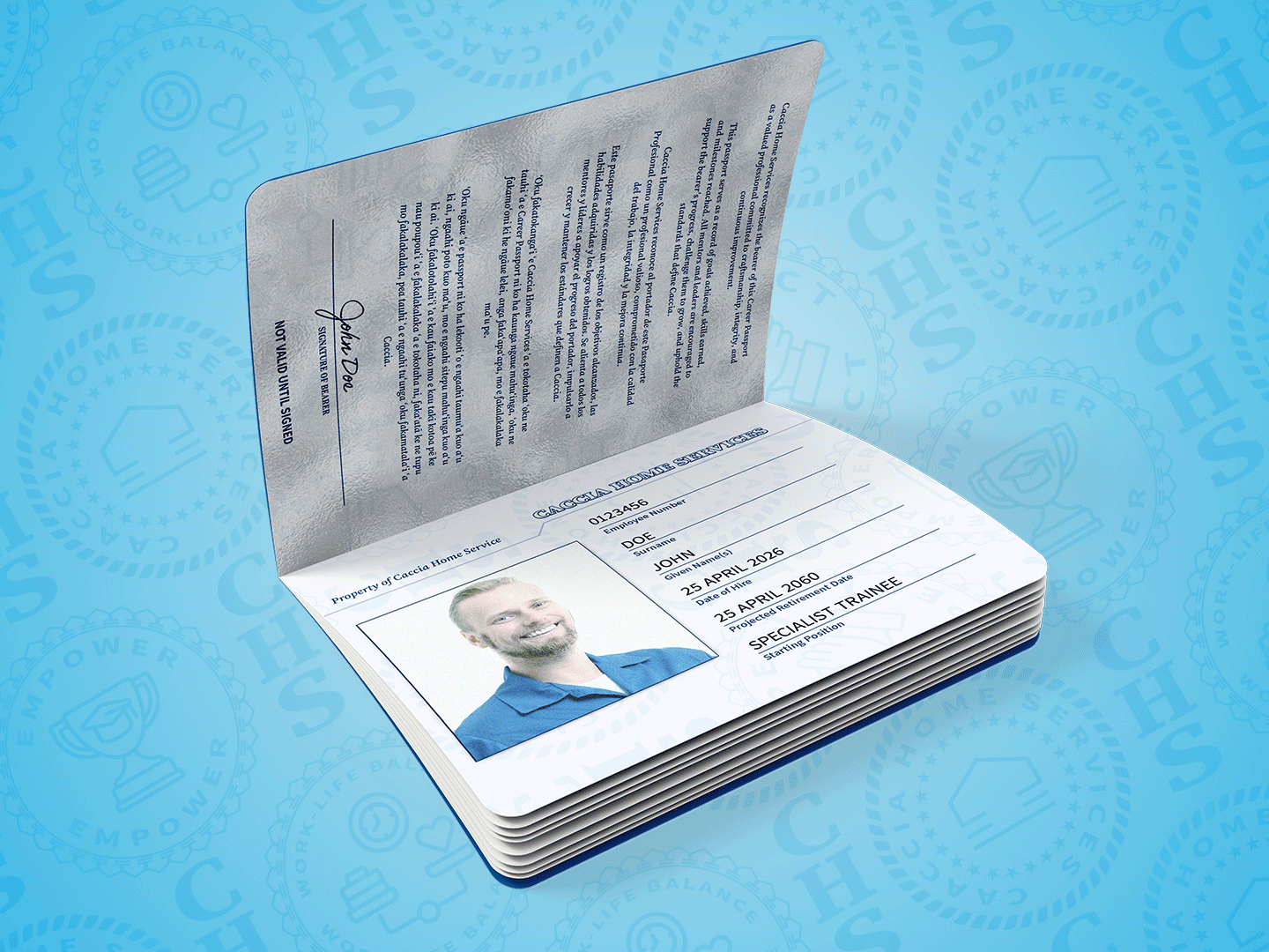
Employee Passport Program
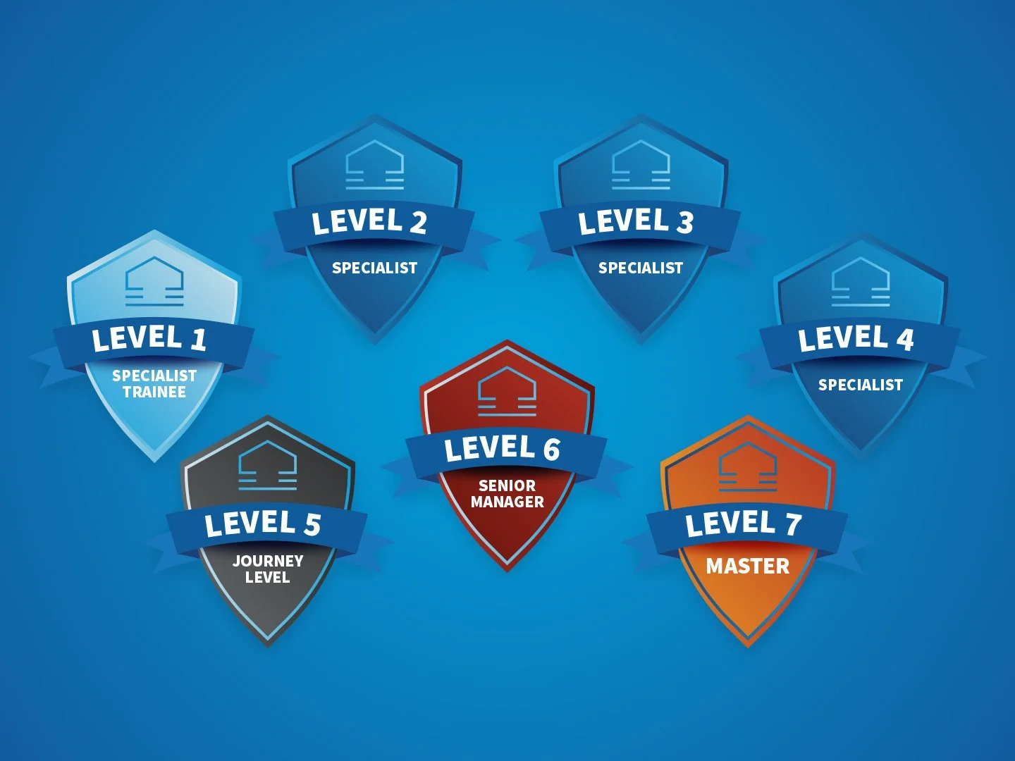
One of the most unique components of the rebrand was the creation of the Caccia Employee Passport—a custom onboarding and career development tool designed to celebrate growth, accountability, and achievement throughout an employee's journey with the company.
Inspired by the look and feel of a United States passport, the booklet transforms employee development into a guided journey from hiring through retirement. The design features a custom eagle emblem on the cover, specialty watermark graphics throughout the interior pages, and a structured progression system that documents professional milestones.
Employees use the passport to track training requirements, technical certifications, department-specific competencies, safety procedures, and leadership development milestones. Supervisors verify completed tasks and achievements throughout the book, creating a tangible record of growth and mastery. The experience culminates in a Certificate of Mastery, recognizing an employee's dedication, skill development, and contribution to the organization.
More than a training document, the Employee Passport became an extension of the Caccia brand reinforcing company culture, encouraging employee engagement, and providing a memorable framework for career progression within the organization.
The Caccia Home Services brand refresh demonstrates how thoughtful evolution can be more powerful than complete reinvention. By preserving the equity built over decades while modernizing the brand experience across customer and employee touchpoints, the project positioned Caccia for continued growth while staying true to the values that made the company successful in the first place.
Website Development: Monochrome